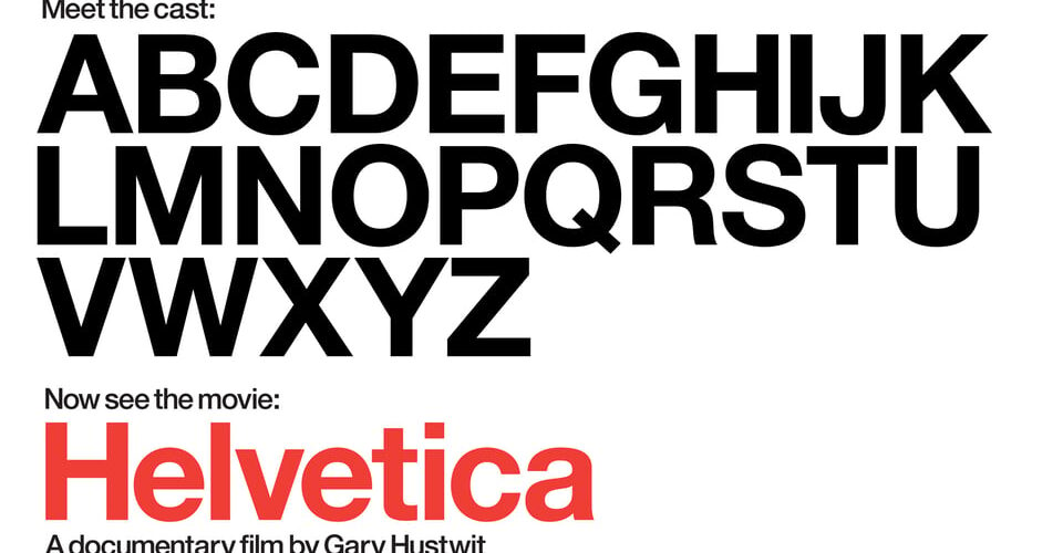
“Helvetica” delves into the origins and widespread adoption of one of the world’s most renowned typefaces. Directed by Gary Hustvit, this documentary marks the inaugural installment of a trilogy exploring various facets of contemporary design. Through conversations with numerous designers and typographers, the film delves into the reasons behind the enduring popularity of Helvetica, which was crafted in 1957 at the Haas Foundry in Switzerland.
Renowned for its clean and versatile appearance, Helvetica has become ubiquitous in modern design, adorning logos for a multitude of companies ranging from Jeep to Tupperware. Widely regarded as the most prevalent sans-serif font in the Western world, Helvetica’s impact on visual communication is profound.
Director Gary Hustvit’s fascination with the intricacies of typeface creation serves as the driving force behind this exploration. Through the lens of designers and typographers, the documentary navigates the spectrum of perspectives on Helvetica, with some praising its clarity and adaptability, while others critique its perceived overuse.
In “Helvetica,” Hustvit endeavors to present a balanced portrayal of the varied opinions surrounding this iconic typeface, shedding light on the nuances of a discipline often overlooked.


Add comment